
Medication Label Safety Checker
Prescription Safety Check
Check if your prescription label meets FDA safety standards. Enter information from your label to verify font size, warning visibility, and color contrast.
Enter information above to check your label
Every time you pick up a prescription, there’s a small but critical piece of information you might overlook: the label on the bottle. It’s not just your name and the drug name. Hidden in plain sight are warning stickers, font sizes, colors, and barcodes-all designed to keep you safe. But if you don’t know what to look for, these labels can confuse more than help.
What’s Really on Your Prescription Label?
Federal law says every prescription label must include your name, the drug name, dosage instructions, and how much is in the bottle. That’s the bare minimum. But what you’ll actually see on the label? It’s messy. One pharmacy uses bold red text for warnings. Another uses small gray print. Some include extra stickers for opioids. Others don’t. This inconsistency is why medication errors still happen.
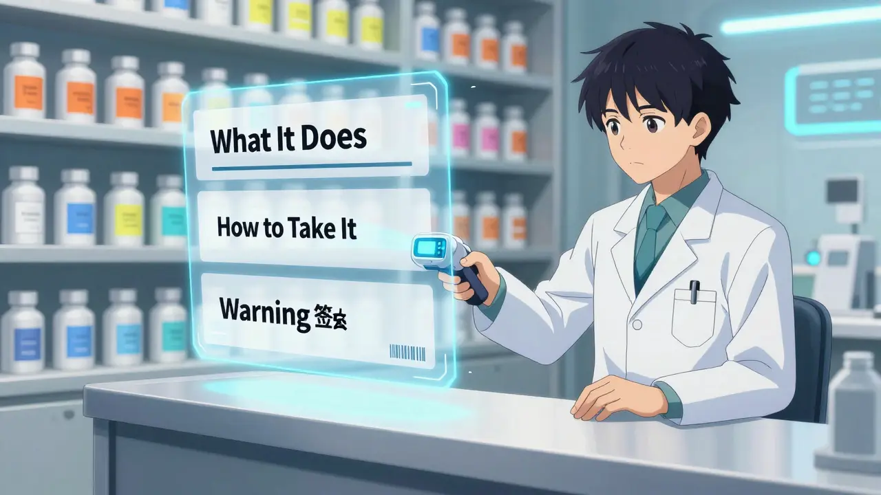
The FDA is trying to fix this. By January 1, 2025, all U.S. pharmacies will have to follow a new standard called the Patient Medication Information (PMI) rule. This means every prescription will come with a single-page, easy-to-read summary. No more hunting through tiny print. The PMI will focus on three things: what the drug does, how to take it safely, and what serious side effects to watch for.
Warning Stickers: More Than Just Red Tape
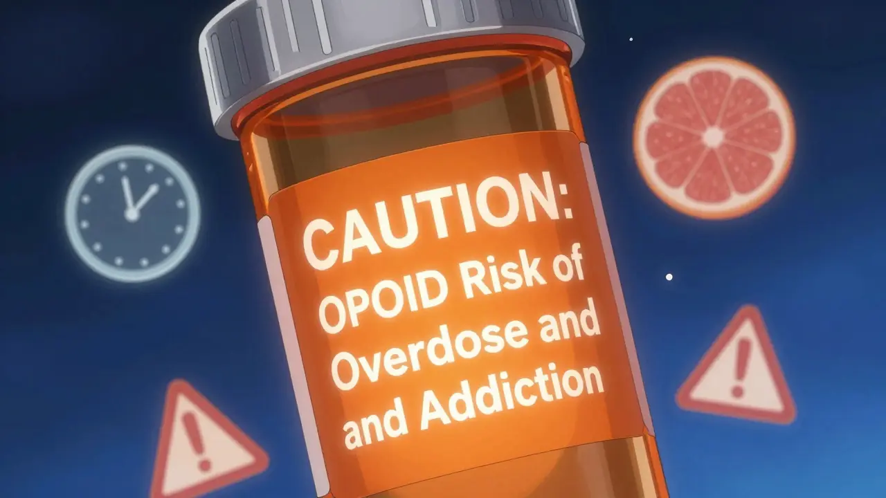
That bright orange sticker on your opioid prescription? It’s not optional. Starting January 1, 2024, Connecticut law requires every controlled substance prescription to have a fluorescent orange warning label, exactly 1¼ inches in diameter. It’s not just for show. Studies show patients are 40% more likely to notice and remember warnings when they’re large, bright, and placed right on the bottle.
Other states are following suit. As of 2025, 27 states require some form of opioid warning label. Some use red text on white. Others use icons. The goal? To stop people from taking too much or mixing drugs dangerously. The sticker might say: “CAUTION: OPIOID Risk of Overdose and Addiction.” That’s not marketing. That’s life-saving.
These stickers aren’t just for opioids. Some pharmacies now use yellow stickers for drugs that cause drowsiness. Blue for drugs that interact with grapefruit. The color coding isn’t nationwide yet-but it’s coming. And if you’re over 65, these visual cues matter more than you think. A 2023 AARP survey found 68% of older adults struggle to read standard labels because the font is too small or the contrast is too low.
Fonts, Colors, and Why They Matter
It’s not just what’s written-it’s how it’s written. The USP General Chapter <17>, adopted by many states, says key information must be in sans-serif fonts like Arial or Helvetica. Why? Serif fonts (like Times New Roman) have little feet on the letters. Those details make reading harder, especially for people with vision problems or low health literacy.
Font size rules are strict: at least 6-point for basic info, 8-point or larger for warnings. That’s bigger than most people realize. If you’ve ever squinted at your label, you’re not imagining it. Many older labels still use 5-point text. That’s illegal under new standards.
Color contrast matters too. White text on a light blue background? That’s a problem. The standard now requires a contrast ratio of at least 4.5:1. That’s the same rule used for websites to meet accessibility guidelines. Pharmacies are upgrading printers to ensure warnings pop-literally-off the label.
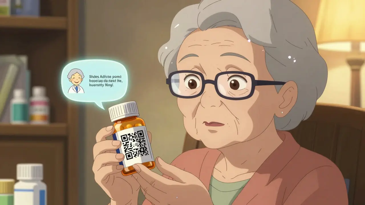
Barcodes and QR Codes: More Than Just Scans
That square barcode on your label? It’s not just for the pharmacy to scan. It contains your drug’s National Drug Code (NDC), lot number, and expiration date. Pharmacy systems use it to catch errors before you leave. If you’re supposed to get 5 mg of lisinopril but the system reads 50 mg? It flags it. That’s how automated verification works.
And now, QR codes are starting to appear. Scan one, and you might get a short video explaining how to take your pill, what foods to avoid, or what to do if you miss a dose. In 2024, 18% of prescriptions included QR codes. That number is expected to hit 75% by 2027. It’s not science fiction-it’s already happening in clinics and pharmacies in California, Oregon, and Minnesota.
Why This All Matters for You
Medication errors are the third leading cause of death in the U.S. Many aren’t from bad doctors or faulty drugs. They’re from misread labels. A patient takes their blood pressure pill instead of their diabetes pill because the labels looked too similar. That’s not rare. Reddit threads from pharmacists are full of stories like that.
One patient in Portland told her pharmacist she didn’t know why she was dizzy after starting a new pill. She’d been taking it with grapefruit juice. The label didn’t say anything about it. Under the new PMI rule, that warning will be front and center.
For older adults managing five or six medications, this isn’t about convenience-it’s about survival. The FDA estimates the PMI rule could reduce medication errors by up to 30%. That’s tens of thousands of preventable hospital visits each year.
What You Should Do Now
You don’t have to wait for 2025 to start reading labels better. Here’s what to check every time you get a new prescription:
- Look for the warning sticker. Is it bright? Is it big? If it’s faded or missing, ask the pharmacist.
- Check the font size. Can you read the dosage instructions without squinting? If not, ask for a larger print copy.
- Verify the name and dose. Does it match what your doctor told you? Don’t assume.
- Scan the barcode. If your pharmacy has a scanner, ask them to show you the info it pulls up. It should match the label.
- Ask about QR codes. If there’s one, scan it. You might get a video explanation.
- Request a translated version. If English isn’t your first language, ask for a label in your native language. California and New York already offer this for common languages.
Pharmacists are trained to explain labels. But they can’t help if you don’t ask. Don’t be shy. Say: “Can you walk me through this label? I want to make sure I understand it right.”
What’s Coming Next
By 2027, you might see augmented reality features on your prescription labels. Point your phone at the bottle, and an animated guide appears showing how to take the pill, what side effects to expect, and when to call your doctor. It sounds like sci-fi, but companies are already testing it.
Right now, the biggest barrier isn’t technology-it’s cost. Small independent pharmacies might spend $5,000 to $15,000 upgrading printers, software, and training staff. That’s why some worry about delays. But the FDA is working with state boards to offer grants and technical support.
The goal is simple: no more guessing. No more confusion. No more mistakes because the label was too small, too vague, or too hidden.
These labels are your safety net. And now, they’re finally being built to work for everyone-not just the people who can read tiny print.
Why do some pharmacy labels look different than others?
Before 2025, there was no national standard. Each state, pharmacy chain, or even individual pharmacist could design labels differently. Some used small fonts, others added extra stickers, and some didn’t include warnings at all. The new FDA Patient Medication Information (PMI) rule will fix this by requiring one uniform format across all U.S. pharmacies starting January 1, 2025.
What does the orange sticker on my opioid prescription mean?
That orange sticker is a state-mandated warning for controlled substances, especially opioids. It’s required in Connecticut and 26 other states as of 2025. The label typically says something like “CAUTION: OPIOID Risk of Overdose and Addiction.” It’s designed to be impossible to miss-bright color, large size-to remind you of the dangers and help prevent misuse.
Can I ask for a larger print label?
Yes, absolutely. Under federal accessibility guidelines and the upcoming PMI rule, pharmacies must provide labels in larger print upon request. If you’re over 65 or have vision problems, you’re not alone-68% of seniors struggle with standard labels. Just ask the pharmacist for a “large print version” or “easy-read label.” They’re required to help.
What’s the purpose of the barcode on my pill bottle?
The barcode holds your drug’s National Drug Code (NDC), lot number, and expiration date. When scanned at the pharmacy, it checks that the right drug, dose, and quantity are being given to you. It’s a safety check that helps prevent mistakes-like giving you someone else’s medicine or the wrong strength. The system also flags if the drug interacts with others you’re taking.
Are QR codes on prescriptions safe to scan?
Yes. QR codes on prescriptions are linked to secure, FDA-approved websites or apps run by the pharmacy or drug manufacturer. They don’t collect personal data. Scanning one might show you a short video on how to take the medicine, what side effects to watch for, or what foods to avoid. It’s just another way to get clear, visual instructions-especially helpful if reading is hard.
Will the new labeling rules cost me more?
No. The cost of upgrading labels and systems is absorbed by pharmacies and manufacturers. Your copay won’t go up because of the new rules. In fact, you could save money in the long run by avoiding hospital visits caused by medication errors. The FDA estimates these changes will prevent tens of thousands of avoidable health problems each year.
What to Do If Something Doesn’t Look Right
If your label looks wrong-wrong drug name, wrong dose, missing warning, or blurry text-don’t take the medicine. Call the pharmacy right away. Ask them to double-check the prescription with your doctor. If they brush you off, ask to speak to the pharmacist-in-charge. You have the right to clear, accurate information.
And if you’re still unsure? Bring the bottle to your doctor or another pharmacist for a second opinion. Medication safety isn’t a guesswork game. With the new rules coming, you’re finally getting labels built for real people-not just legal compliance.
13 Comments
Russell Thomas December 29, 2025 AT 07:18
Oh great, another government mandate that costs pharmacies $15k to implement so I can finally read my pill bottle without a magnifying glass.
Meanwhile, my grandma still takes her blood pressure med with grapefruit juice because the label said 'avoid citrus' in 4-point font.
At least now the orange sticker will scream at her like a drunk uncle at Thanksgiving. Progress?
Alex Ronald December 29, 2025 AT 12:11
This is actually huge. I work in geriatric care and seeing patients mix up meds because labels looked too similar used to be weekly. The PMI rule isn’t just nice-it’s life-saving.
Big font, clear warnings, QR codes with video instructions? That’s not bureaucracy. That’s dignity.
Especially for folks who can’t afford glasses but still need to take five pills a day.
Teresa Rodriguez leon December 30, 2025 AT 02:06
I’ve been fighting with pharmacies for years over tiny print. They always say 'it’s standard.' It’s not. It’s lazy.
My mother nearly overdosed on lisinopril because the '5mg' looked like '50mg' in that awful serif font.
Finally, someone’s listening. Don’t let them roll this back.
Manan Pandya December 30, 2025 AT 14:58
The adoption of sans-serif fonts and 4.5:1 contrast ratio aligns with WCAG 2.1 guidelines for accessibility. This is a commendable step toward inclusive healthcare design.
Moreover, the integration of QR codes with FDA-approved multimedia content represents a pragmatic fusion of public health policy and digital innovation.
Pharmacies must ensure backward compatibility with legacy systems during transition.
Emma Duquemin December 31, 2025 AT 01:04
OMG I CRIED reading this.
My dad died because he took his insulin instead of his heart med-labels looked identical.
Now they’re putting big orange stickers on opioids? GOOD.
Yellow for drowsiness? BLUE for grapefruit? YES.
QR codes with videos? I want to hug every pharmacist who makes this happen.
This isn’t paperwork. This is love in Helvetica.
They’re finally designing for humans. Not lawyers. Not accountants. HUMANS.
Kevin Lopez January 1, 2026 AT 12:21
PMI compliance is non-negotiable under 21 CFR 211.25. Any deviation from USP <61> font specs or 4.5:1 contrast violates FDA labeling mandates.
QR codes must be ISO/IEC 18004-compliant. NDC must be GS1-128 encoded.
If your pharmacy isn’t scanning and validating at point-of-dispense, they’re negligent.
Duncan Careless January 3, 2026 AT 09:37
bloody brilliant this is.
used to get my gran’s meds and she’d just guess what the scrip said.
now she can scan it and get a video sayin’ 'don’t drink grapefruit juice, love'
pharmacist at mine even printed a big version for her. no extra charge.
small things, yeah? but they matter.
Samar Khan January 4, 2026 AT 08:49
This is so performative. 🤡
They’re putting orange stickers on opioids but still letting pharmacies use 5-point font for 'take with food'.
And who’s gonna scan the QR code if you’re 80 and your phone dies?
Meanwhile, the real problem? $2000 insulin. But no one’s stickering that. 💅
Joe Kwon January 6, 2026 AT 05:31
I’m really glad this is happening.
As someone who’s had to explain to my mom why she can’t take her statin with grapefruit juice-again-I get how easy it is to miss stuff.
The QR code idea? Genius.
And the color coding? I’ve seen blue stickers for grapefruit interactions in my local CVS already.
Let’s keep pushing for universal translation options too. My aunt doesn’t speak English. She deserves clear labels too.
Nicole K. January 6, 2026 AT 10:28
People still don’t read labels? That’s on them.
My kid knows not to mix alcohol with pills at age 12.
If you can’t read 8-point font, get glasses.
Stop blaming the system. Take responsibility.
Fabian Riewe January 7, 2026 AT 04:41
Honestly? This is the kind of thing that makes me proud to live here.
I used to work at a pharmacy and saw so many people squinting, asking 'is this 5 or 50?'
Now they’re making it easy? Perfect.
And the QR code thing? My uncle in Oregon scanned his and got a 30-second video of a nurse saying 'take this before bed.' He said it finally made sense.
Small wins, y’all. Keep ‘em coming.
Amy Cannon January 9, 2026 AT 01:24
The evolution of pharmaceutical labeling from the archaic, typographically chaotic, and visually inaccessible formats of the pre-2025 era to the standardized, accessibility-compliant, and multimodal Patient Medication Information paradigm represents a profound sociotechnical advancement in public health infrastructure.
It is imperative to acknowledge the confluence of regulatory rigor, ergonomic design principles, and digital integration that undergirds this transformation.
Moreover, the integration of QR-based multimedia content not only enhances comprehension but also mitigates linguistic and cognitive barriers, thereby fostering health equity across diverse demographic cohorts.
That said, the financial burden on small, independent pharmacies remains a critical implementation challenge that requires sustained federal and state-level subsidy mechanisms to ensure equitable adoption.
Himanshu Singh January 10, 2026 AT 20:24
this is amazinnggg. my aunt in delhi cant read english but she takes 6 pills a day. if they make labels in hindi or spanish or whatever, that’s a game changer.
also, the orange sticker? YES. my cousin died from an opioid mixup.
please make this happen fast.
ps: typo? sorry. im excited.